Structural Packaging Design


A water brand refresh.
With the development of a new Aquafina Visual Identity System, we were able to develop a clear universal set of brand values and attributes which can be applied across graphics, language, and physical forms – creating guidelines for a universally consistent brand expression.

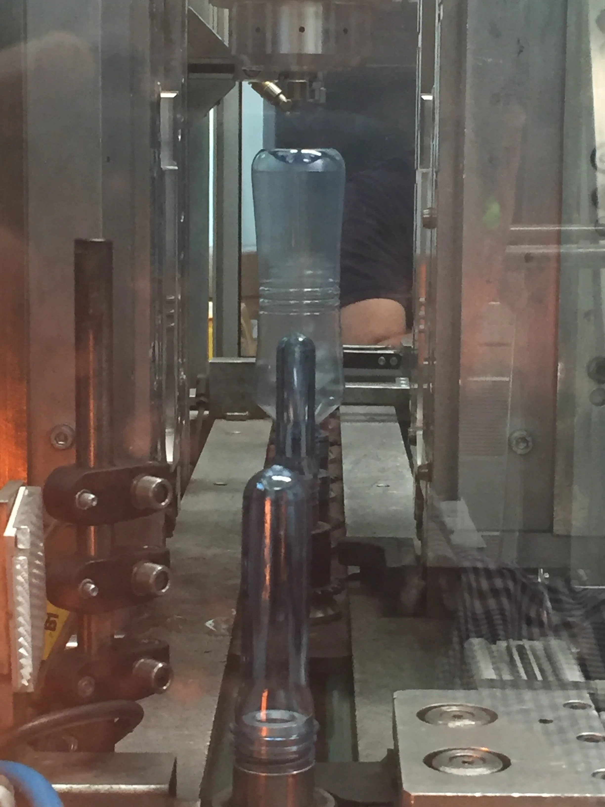
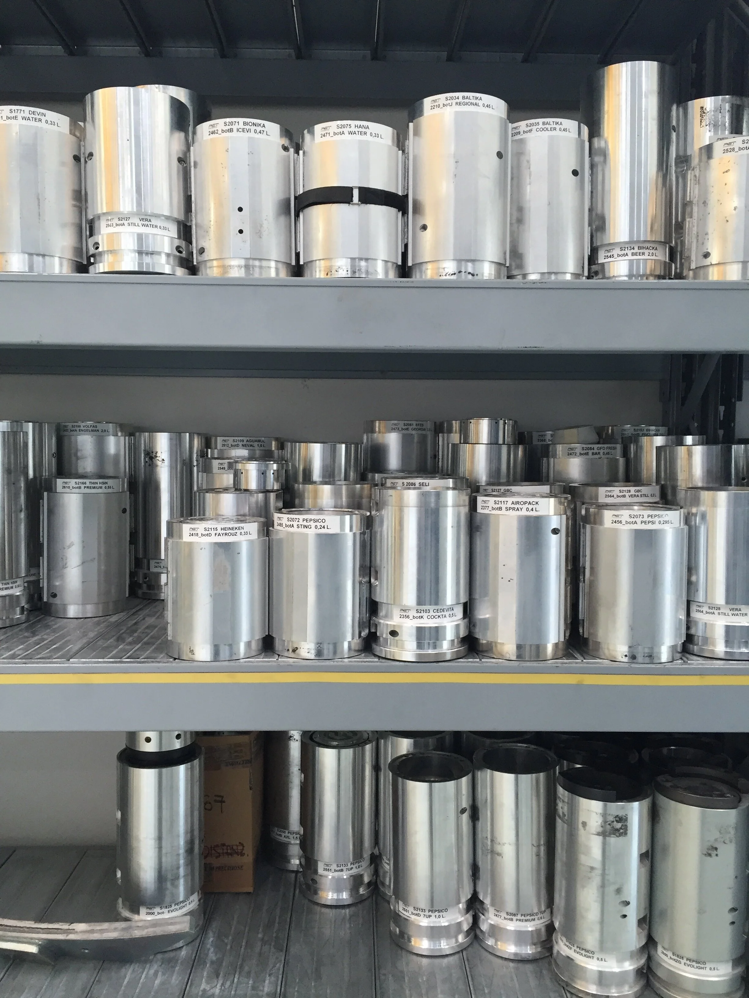
Structural integrity,
integrated.
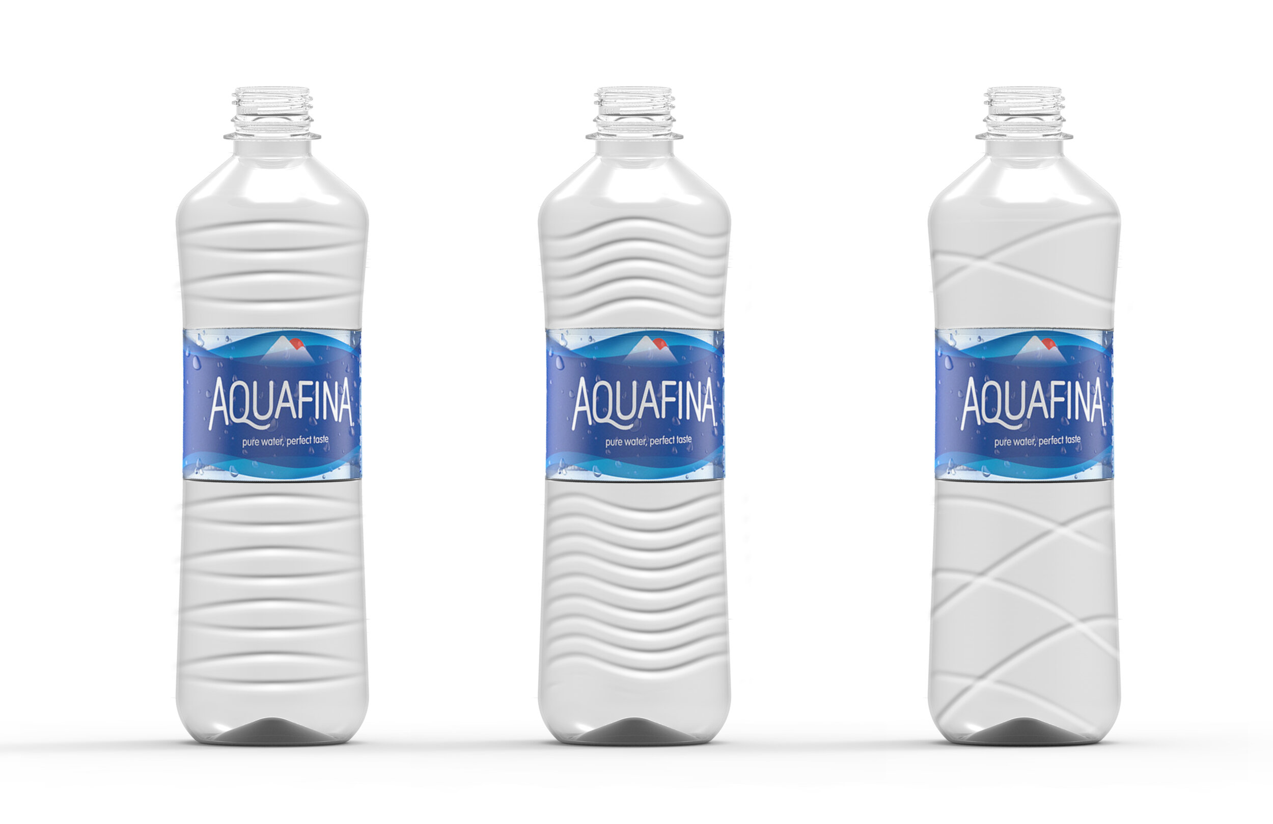
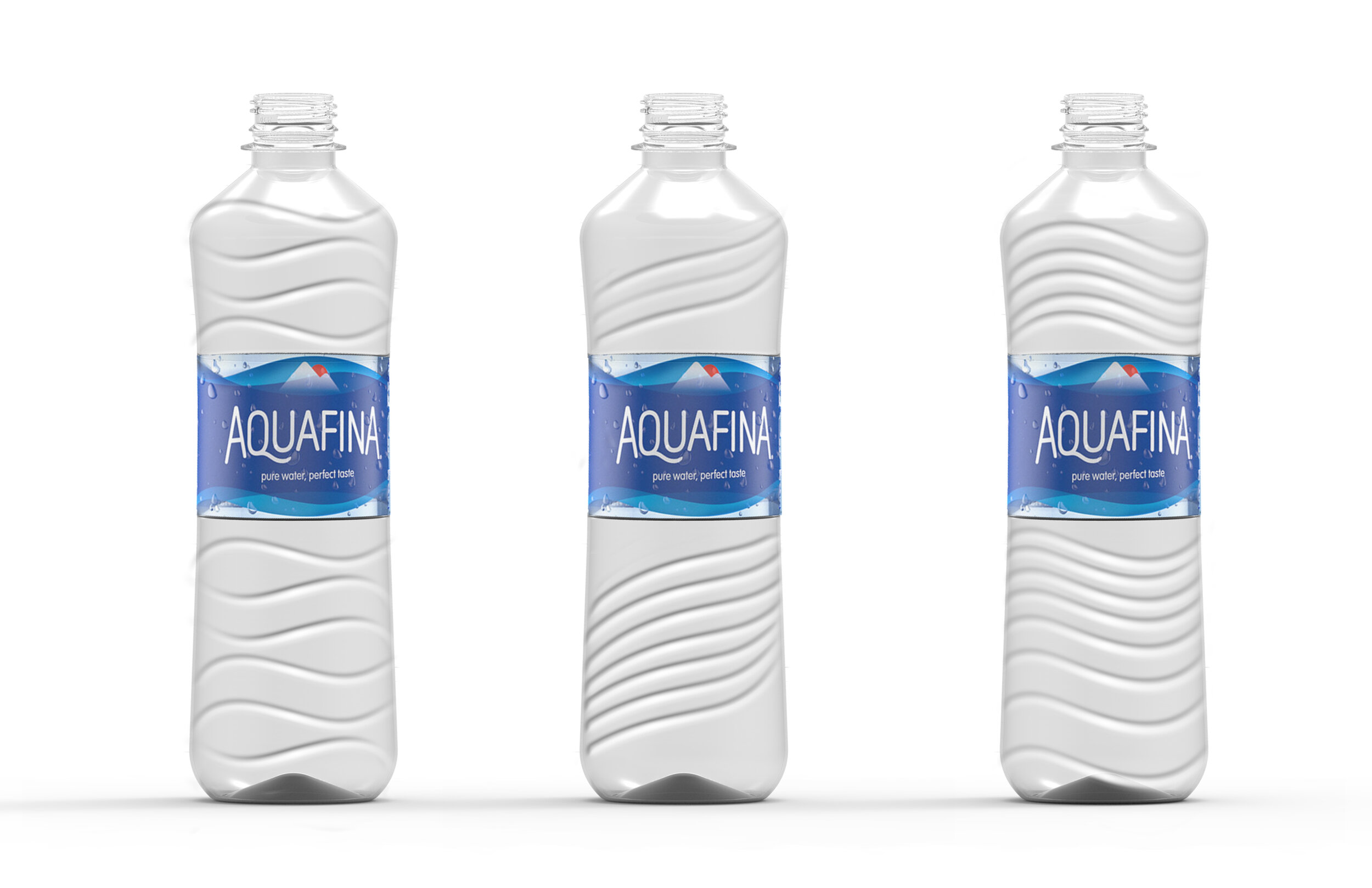
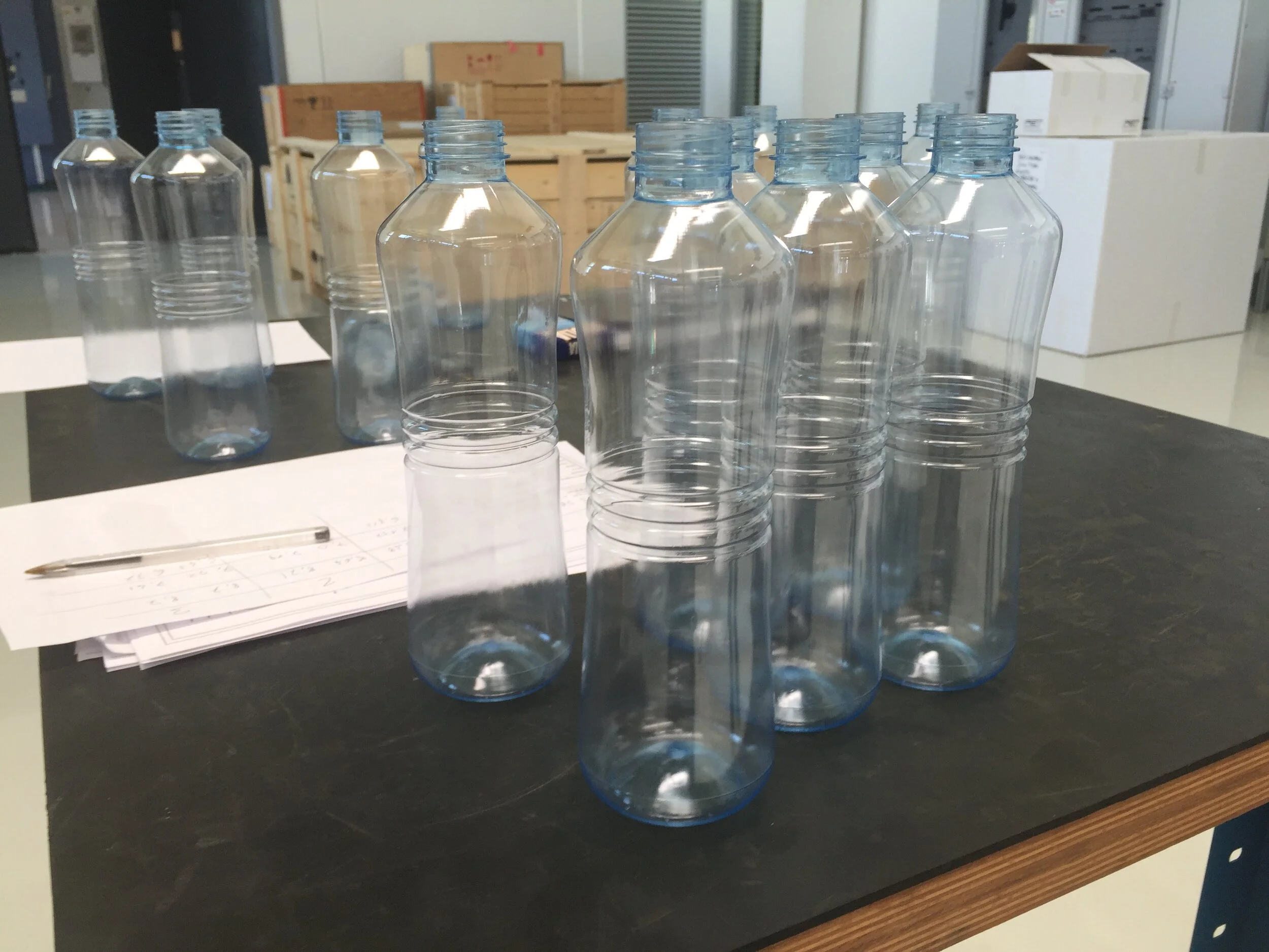
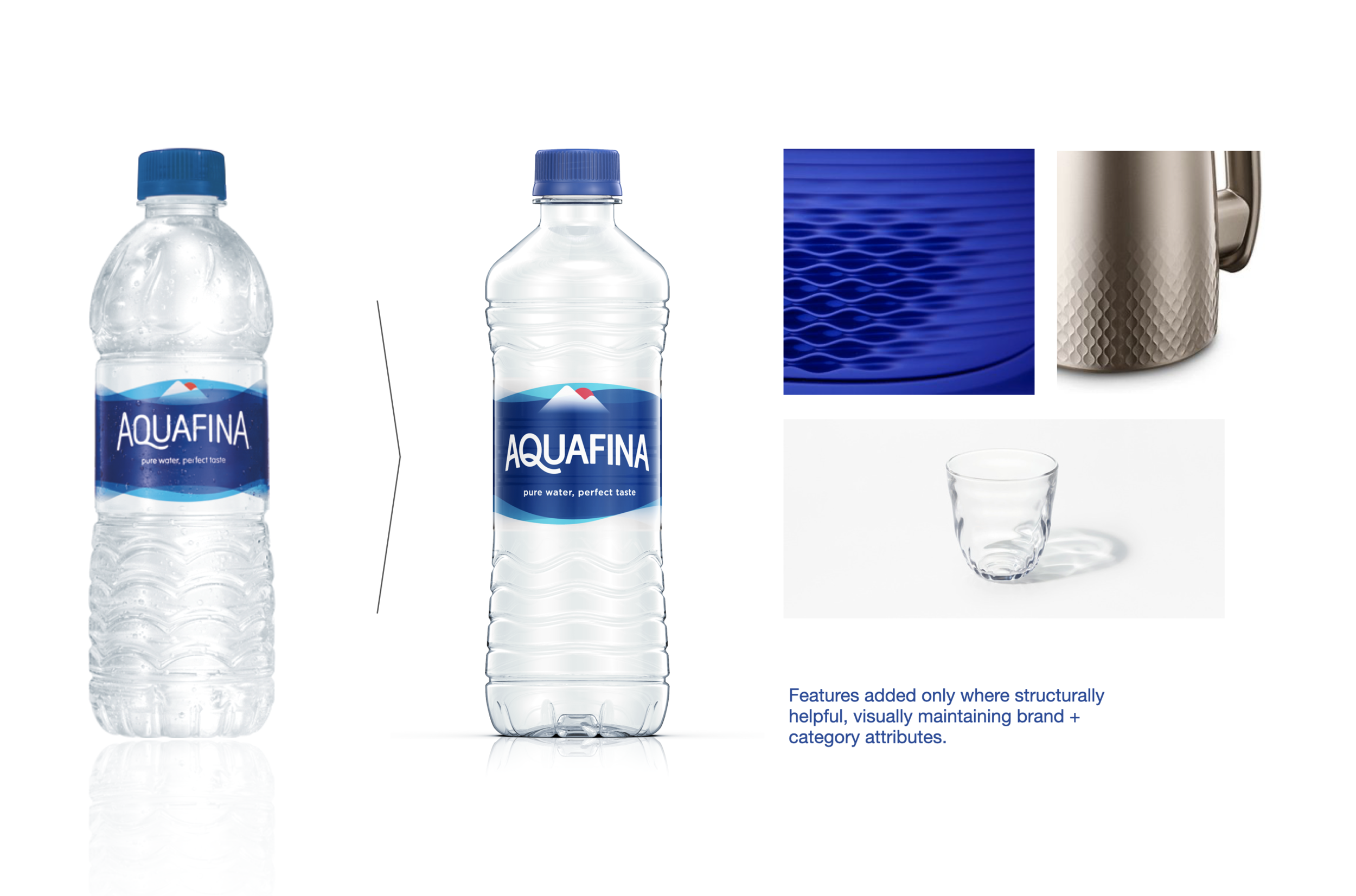
Inside the bottle, Aquafina is pure, clean, and clear. We set out to make a bottle that reflects the purity of the water inside.
The bottle’s hourglass form intuitively guides the hand to a slim waist. Optimized material distribution and structural rib design hidden behind the label allow us to use less plastic overall, while keeping the package as strong as it needs to be, where it matters most.


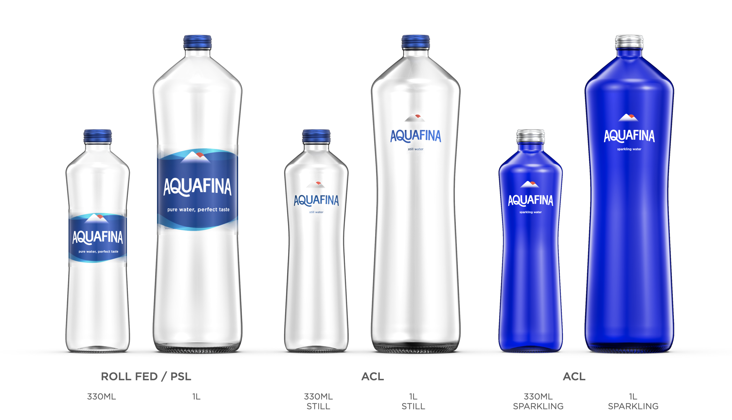
Aquafina Equity Bottle

Unifying a Global Brand

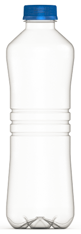
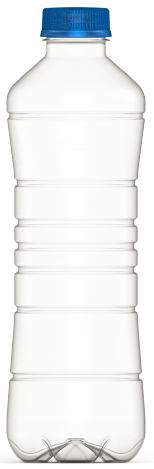
Aquafina’s brand and packaging experiences were largely inconsistent across the many regions in which the brand exists, preventing the global brand from building recognition or equity.

From generic soda bottle,

to brand expression.
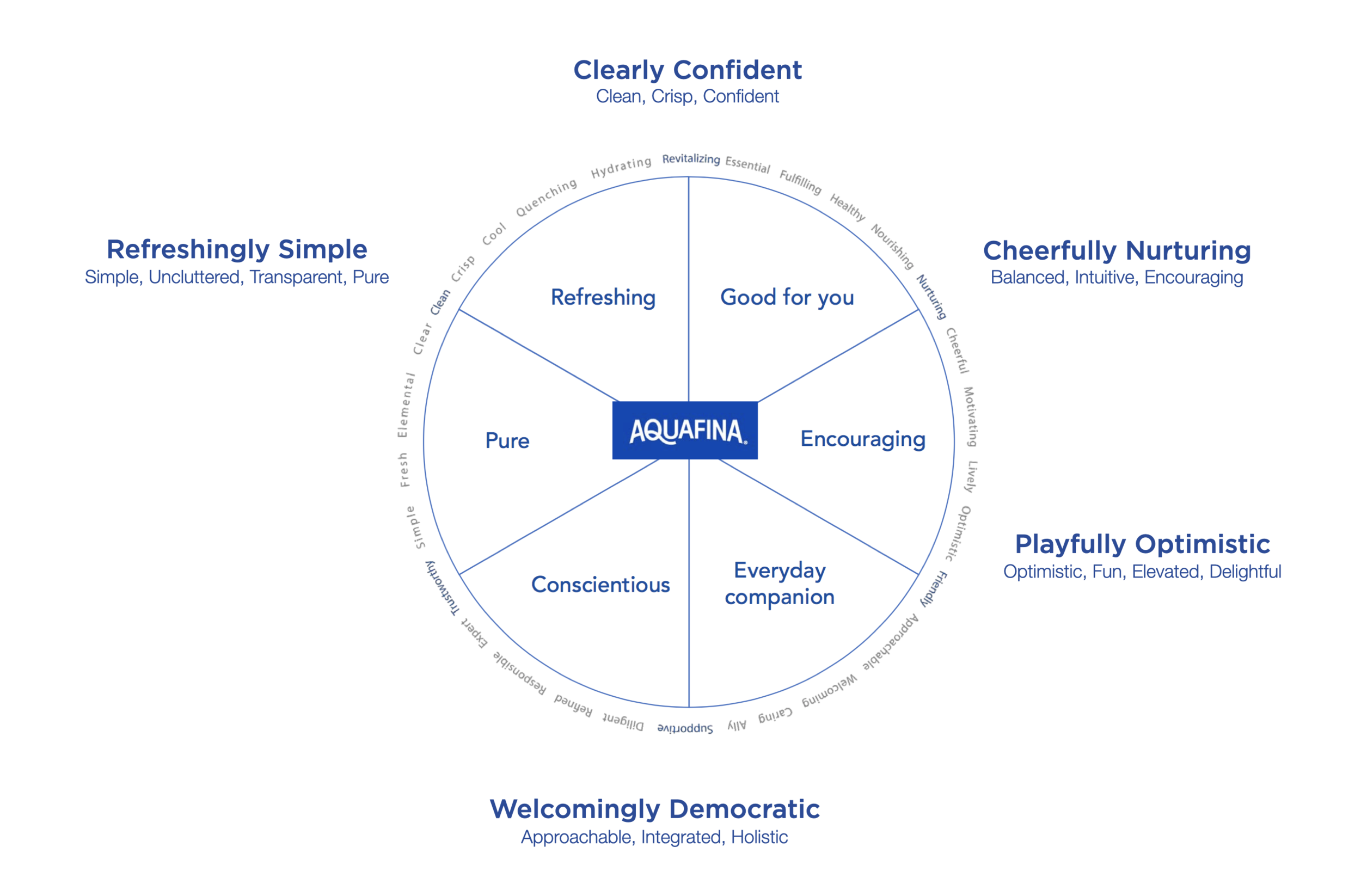
Translating brand attributes
into equity elements.


simple, uncluttered, transparent, pure, approachable, integrated, holistic, optimistic, fun, elevated, delightful, balanced, intuitive, encouraging, clean,
crisp, confident
Clean lines don’t come easily.
In addition to being decorative, the “ripple” elements on the existing bottle provide additional structure to the bottle, and are in fact a key contributor to the bottle’s overall structural integrity.
Finding a way to deliver purity, clarity, and simplicity while avoiding arbitrary decoration became a top priority for the Aquafina equity bottle.